Apply Ai
AI-powered job application assistant
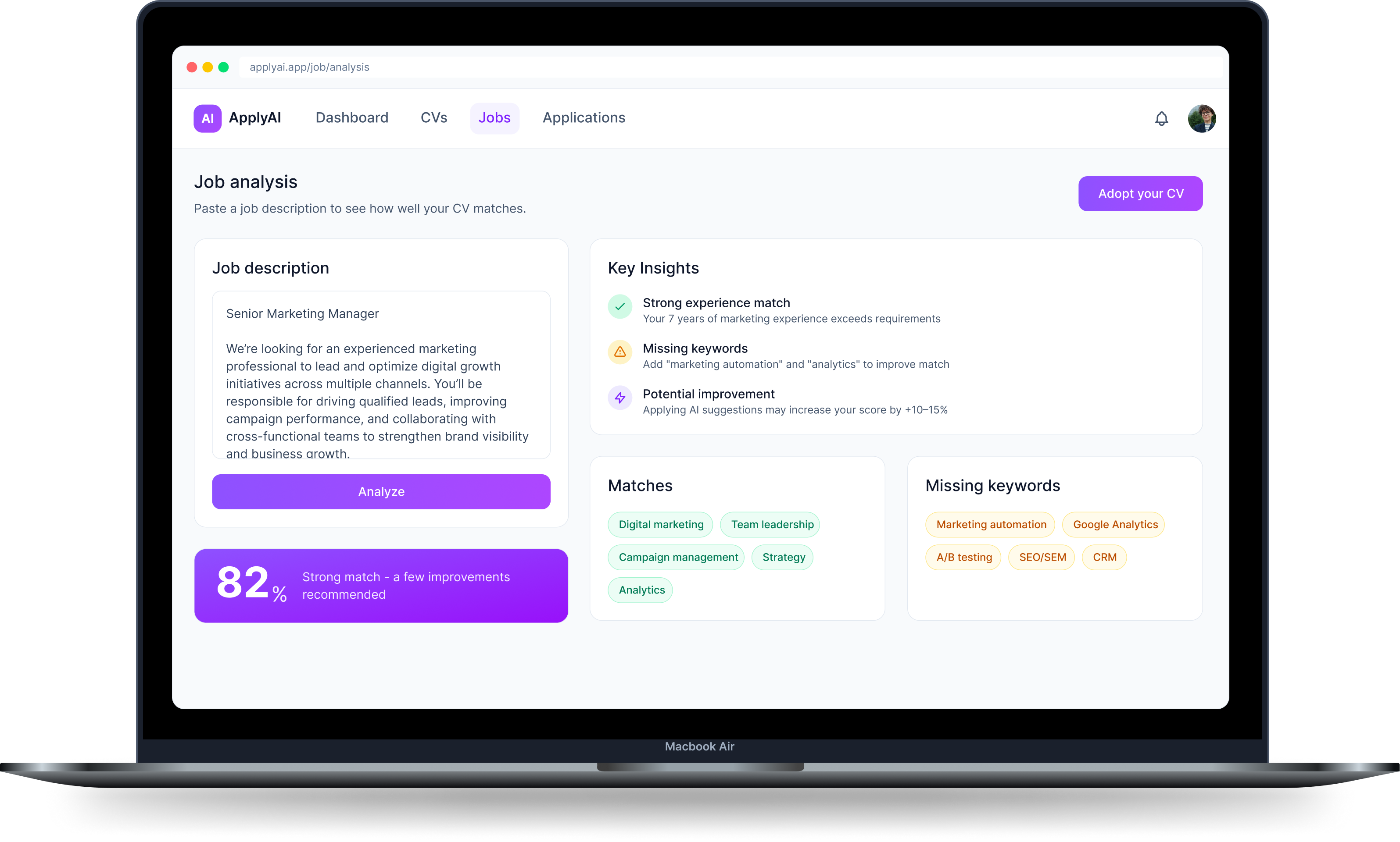
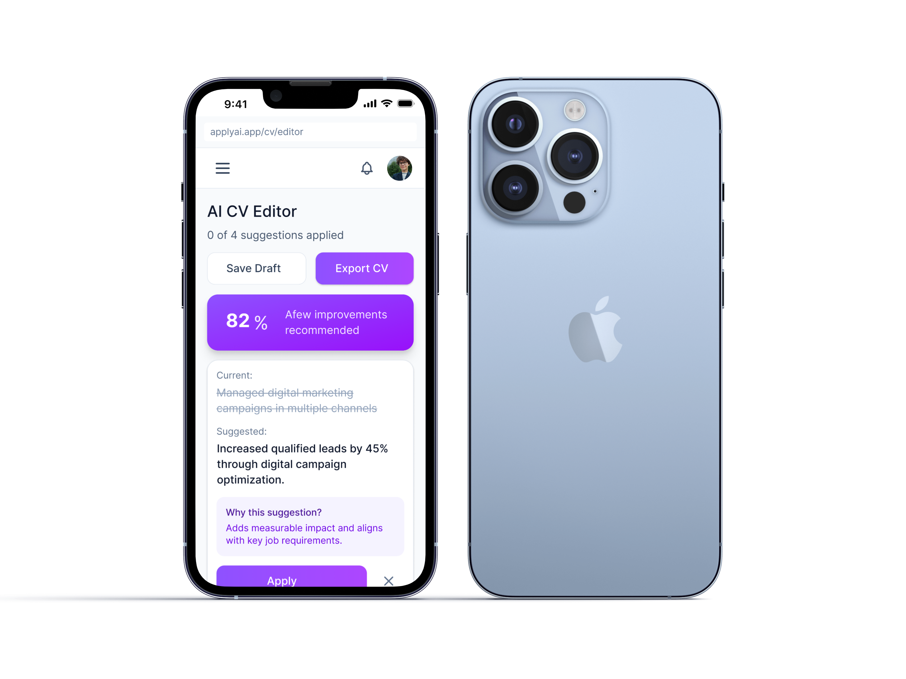
A responsive SaaS app for AI-powered CV optimization, match scoring, and application tracking.
Product Design · UX Research · AI Workflows
View →
FARI DESIGN
Go to Final UI
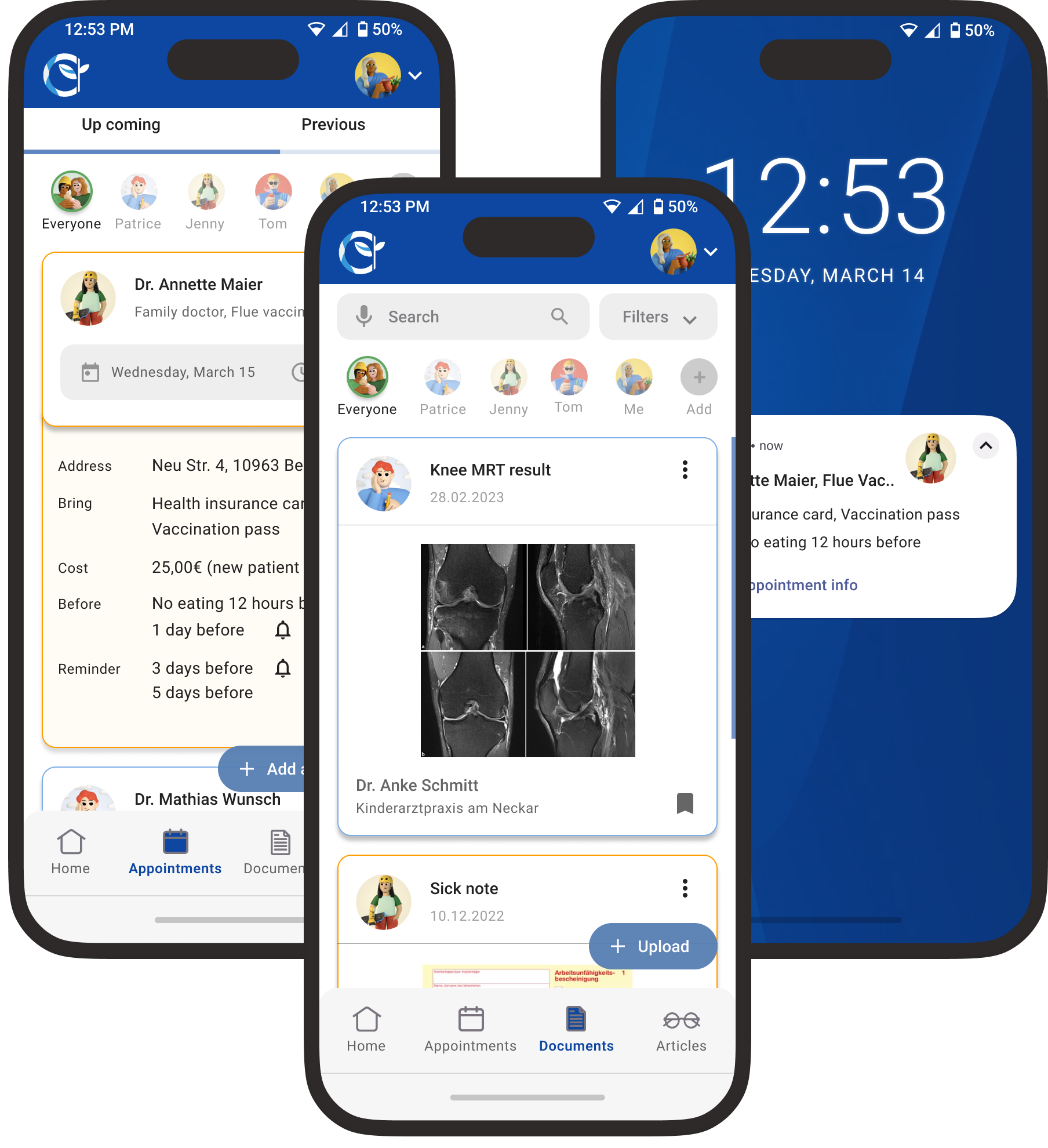
Health Aid was created as part of my certified UX design course at CareerFoundry, focused on simplifying family health management. User research revealed that parents struggle with tracking appointments, vaccinations, and medical records. Health Aid addresses this with an all-in-one, intuitive platform for managing family health, including appointment tracking, vaccination progress, medical records, and partner collaboration.
For Health Aid, I followed a user-centered design thinking approach, starting with broad research and narrowing into specific user needs. Through generative research and empathy-driven insights, I defined clear goals that guided the design process, resulting in a meaningful solution tailored to real user needs.
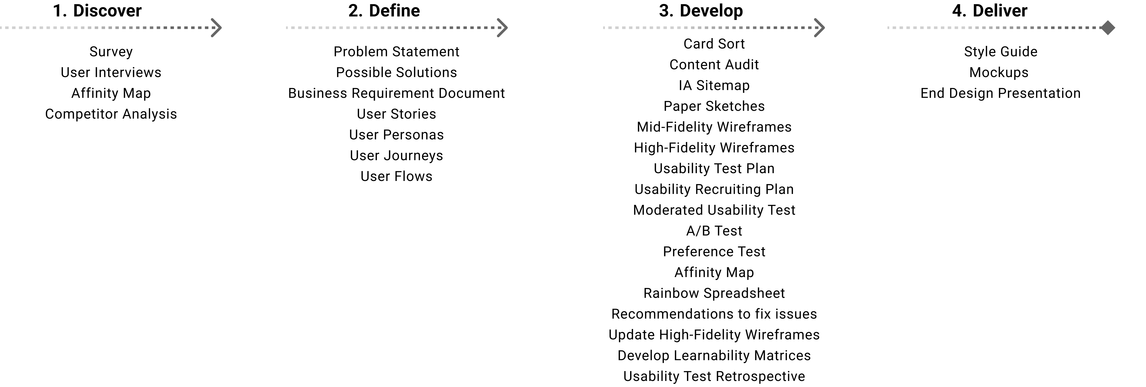
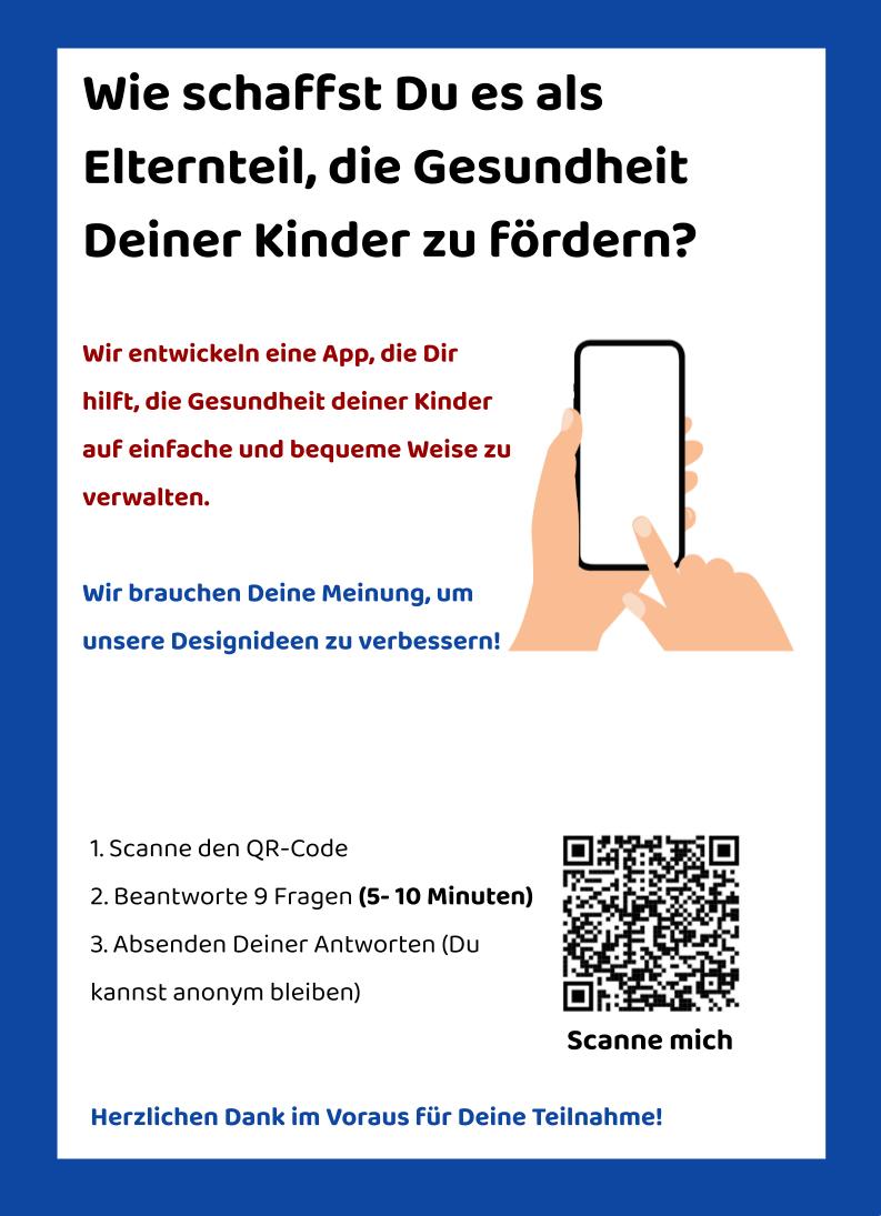
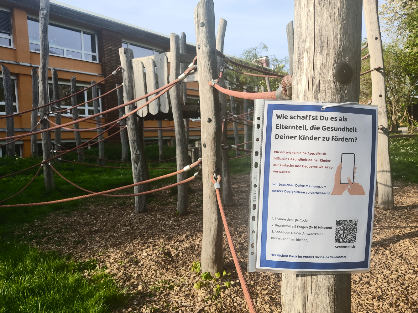
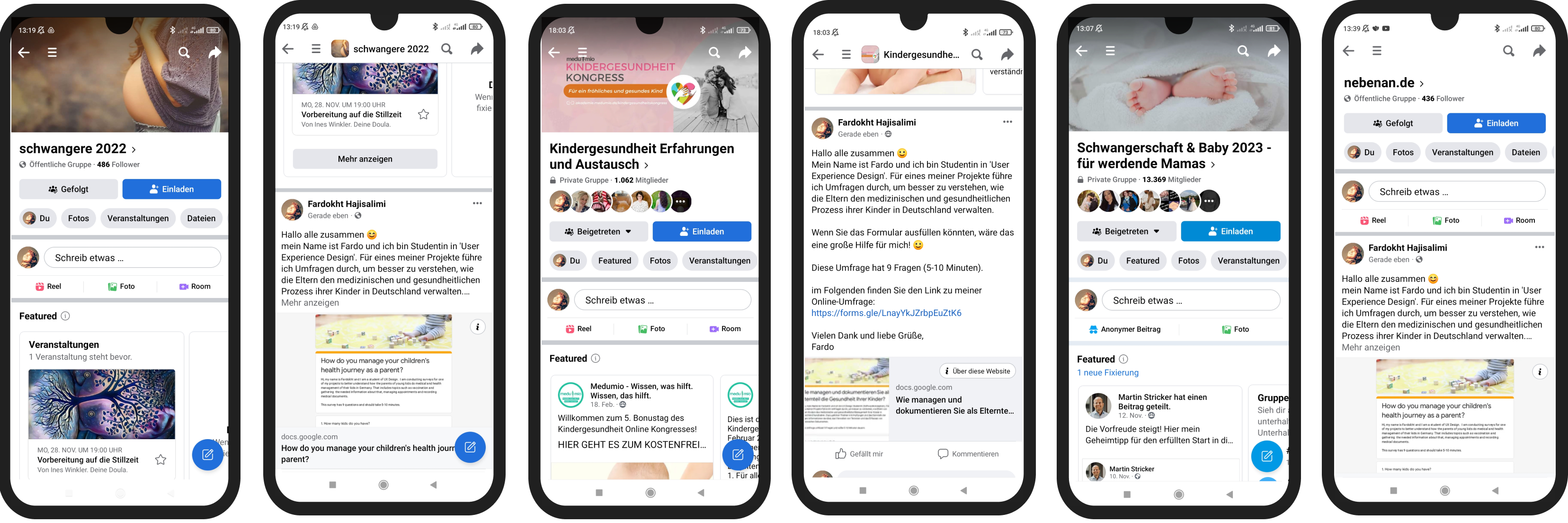
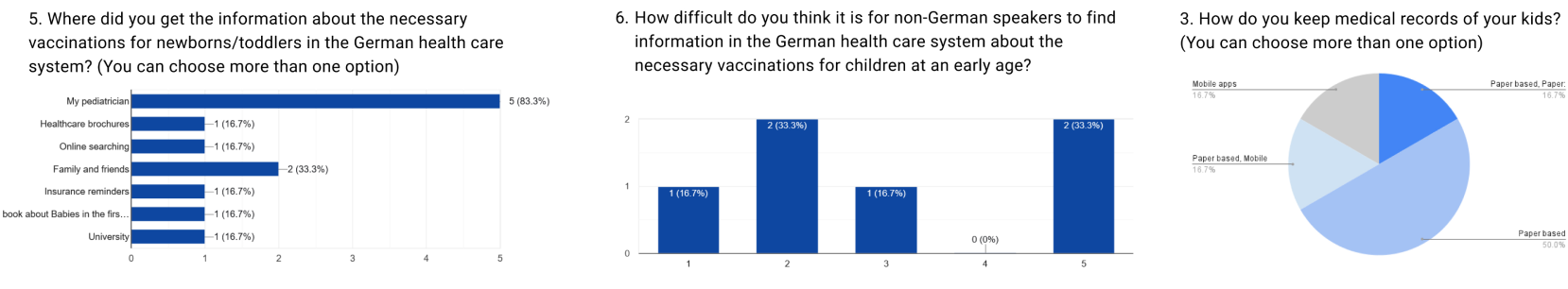
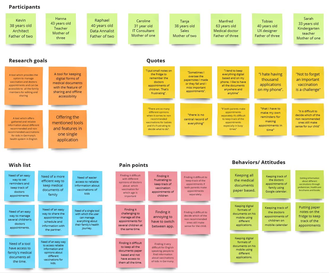
To understand user needs, I conducted surveys and moderated interviews in English and German with parents aged 25–45, primarily those with young children. Participants were recruited through Facebook groups and public spaces like playgrounds, pediatric clinics, and kindergartens. This diverse research approach provided valuable insights that helped shape an inclusive, user-focused solution.
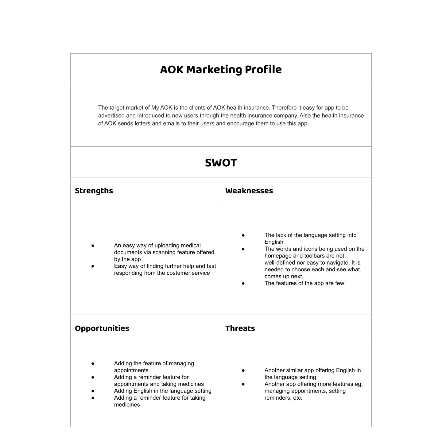
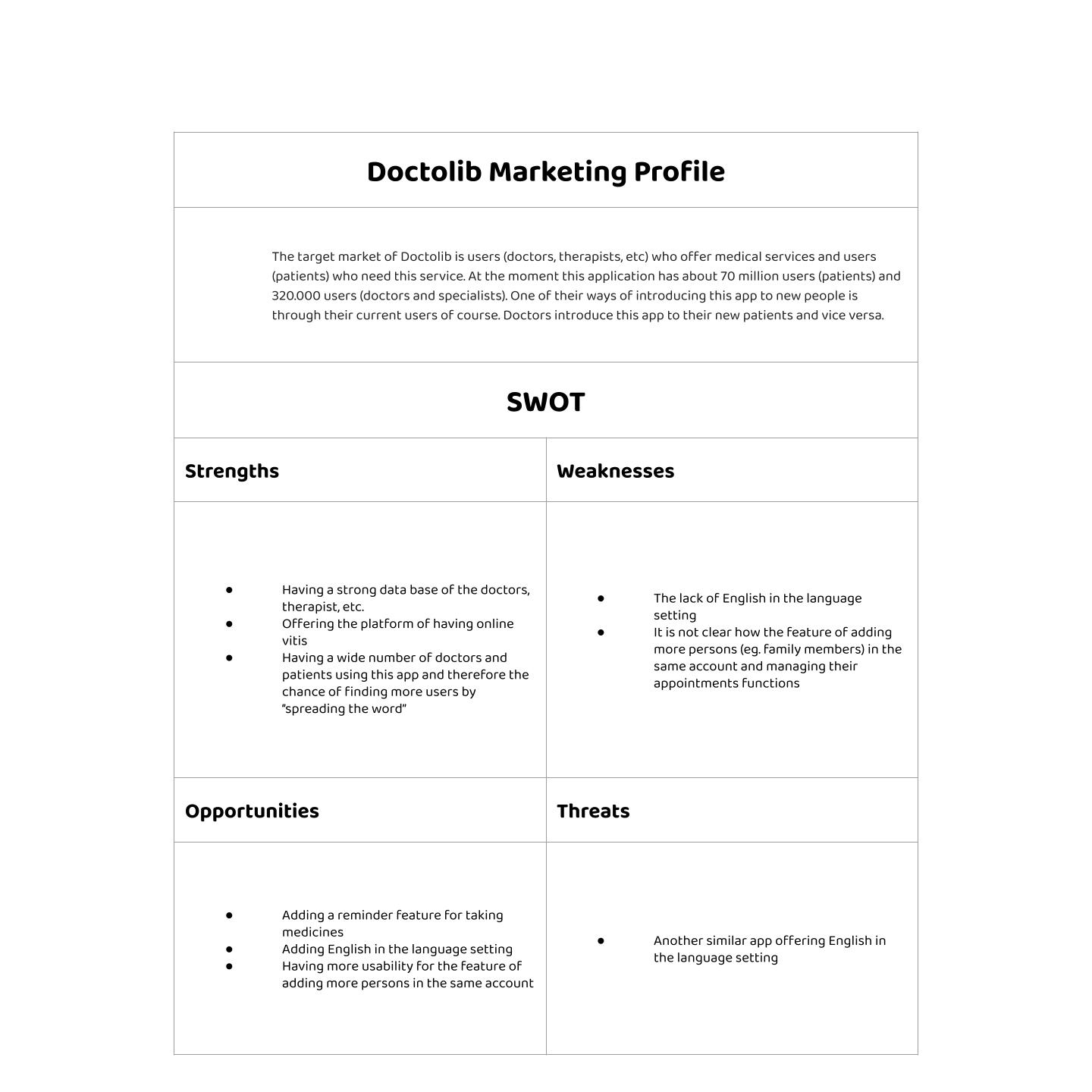
By conducting a marketing profile, SWOT analysis, and UX evaluation of Doctolib and AOK apps, I was able to identify the issues users encounter while using competing products and determine their expectations for Health Aid. The aim of this analysis was to gain a better understanding of what users want in a health app and find ways for Health Aid to stand out from its rivals.
Users need a reliable and efficient way to manage the health journey of their family that saves time and reduces stress. Because managing the healthcare needs of a family can be challenging, especially when it involves keeping track of multiple medical appointments, vaccination progress, and medical documents.
We believe that by providing an intuitive and user-friendly app, families will have an easier time managing their healthcare needs. We will know this to be true when we see users’ successful adoption of the app and their improved experience in managing their family’s health journey.
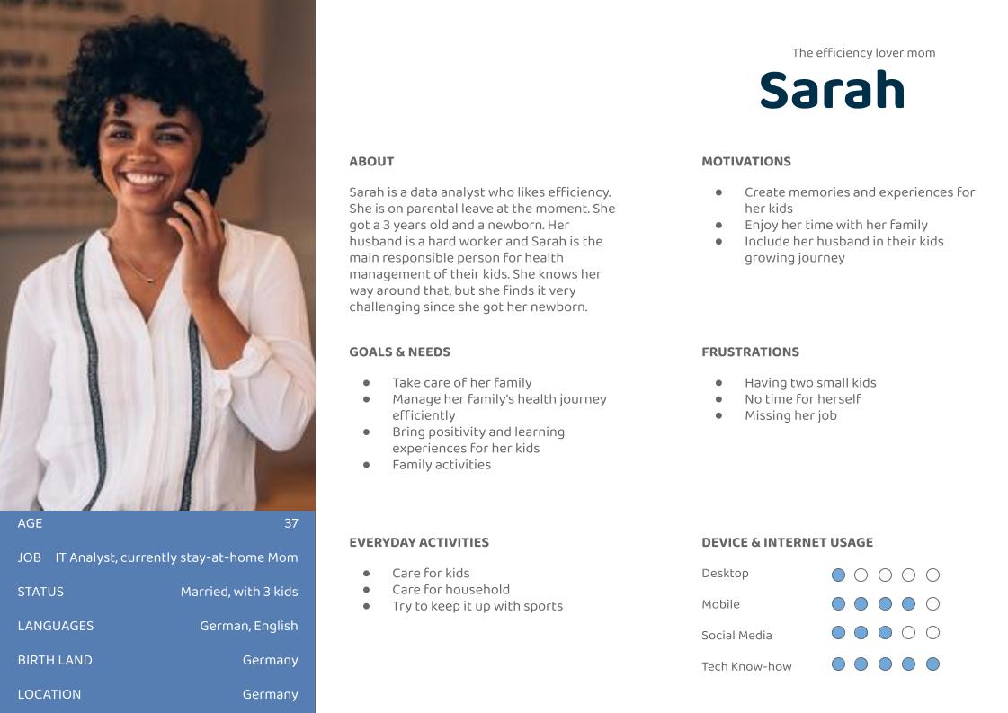
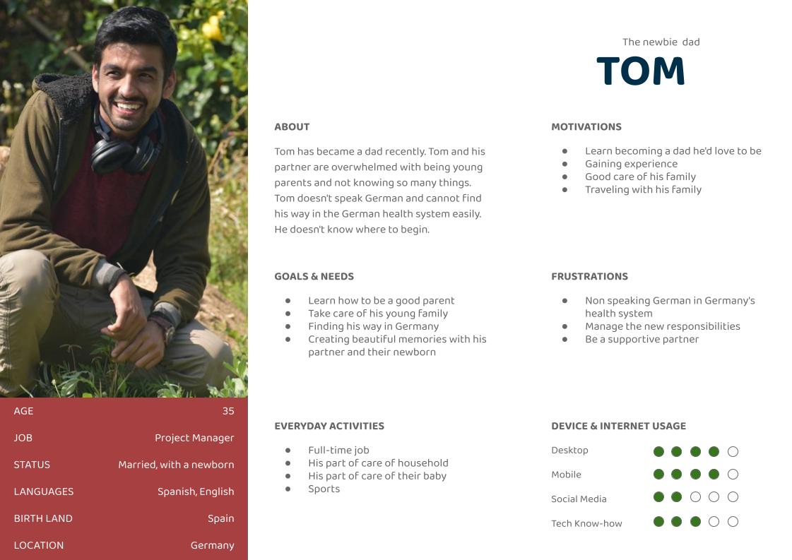
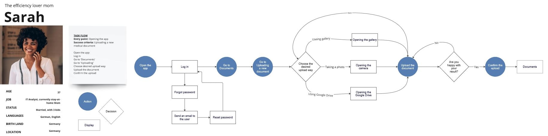
Two personas were created to represent key user groups and better understand their goals, motivations, and pain points throughout the process.
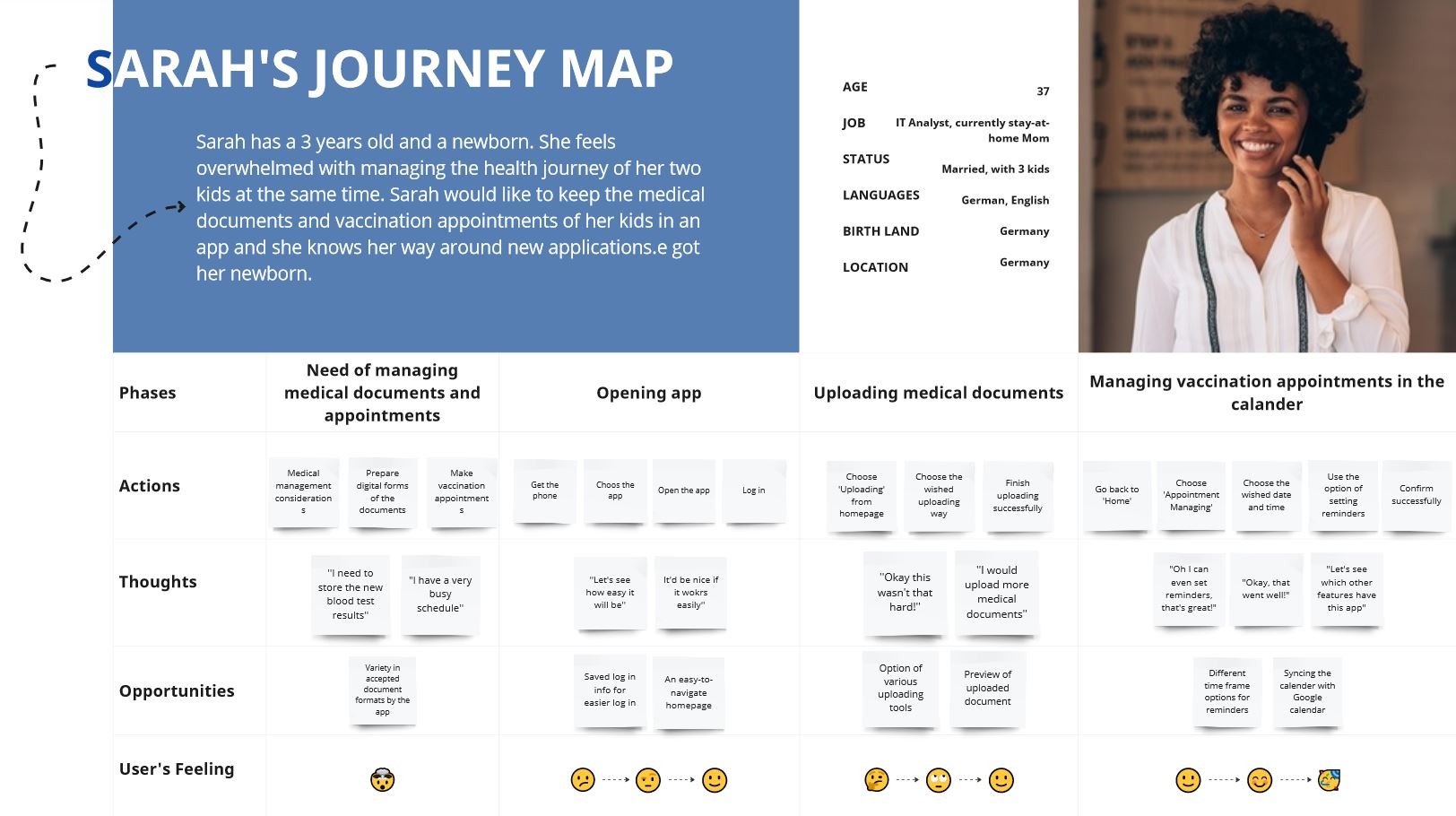
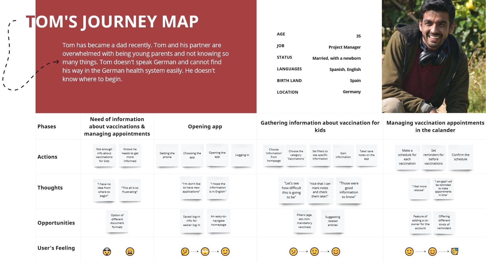
To gain a better understanding of Sarah and Tom’s experience while completing specific tasks, I created Mental Models and User Journeys. These tools help me delve deeper into their thoughts, emotions, and actions throughout the process, highlighting potential pain points and areas for improvement.
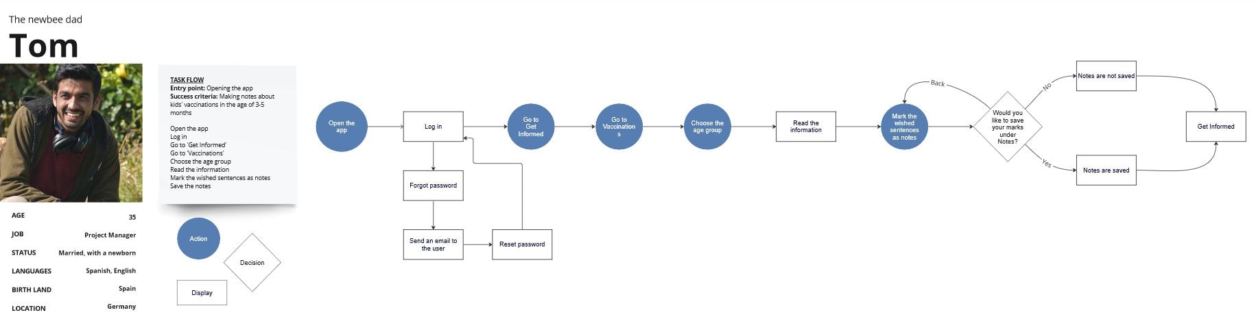
To ensure a user-friendly experience for Sarah and Tom, I have developed User Flows that guide them through each step of their tasks, while minimizing potential pain points and frustrations. By placing the user’s needs at the center of the design process, my goal was to make the task flow as smooth as possible, minimizing frustration and enhancing the overall user experience.
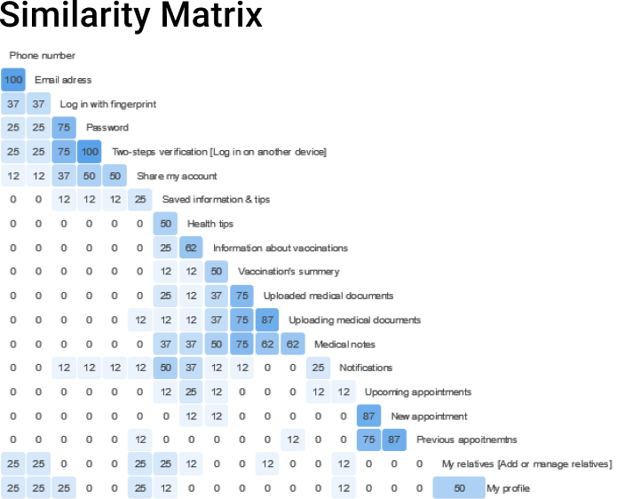
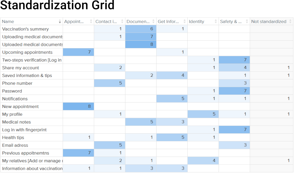
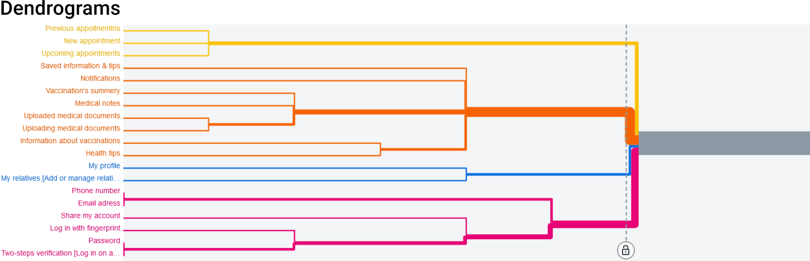
I conducted a closed card sort using Optimal Workshop to test category labels and identify confusing wording. This revealed unclear labels like “Get Informed,” overlapping subcategories, and helped refine the information architecture using insights from the Standardization Grid, Similarity Matrix, and Dendrograms.
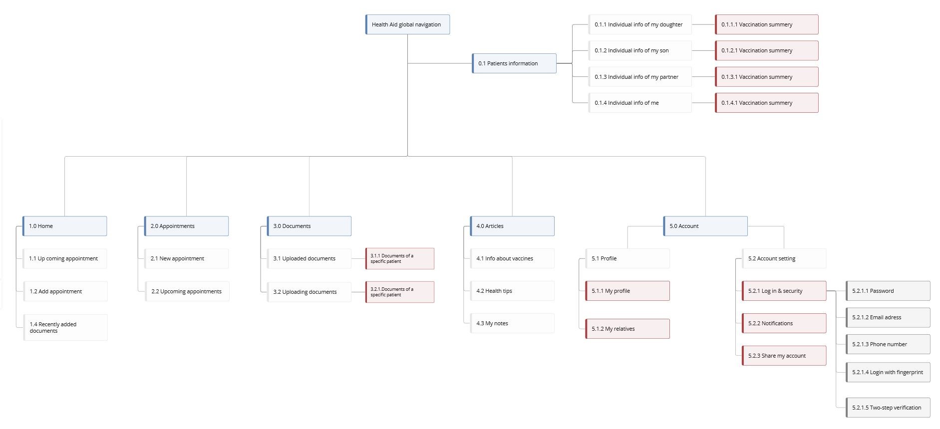
The insights gained from competitive analysis, user interviews, surveys, user flows, and cart sorting results, I was able to develop a more user-friendly and intuitive navigation system and an AI site map for Health Aid.
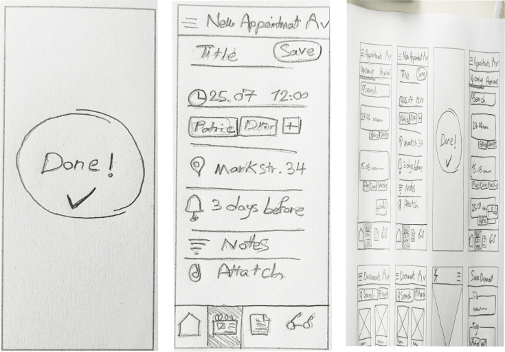
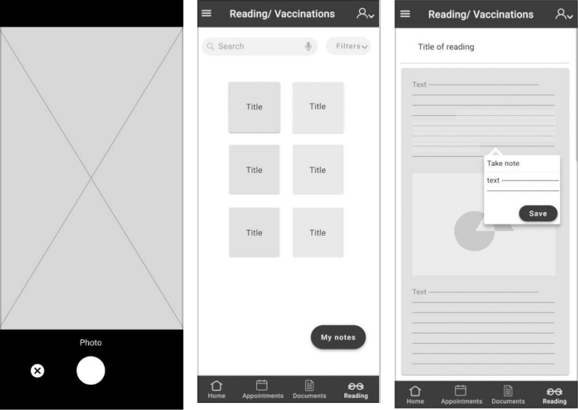
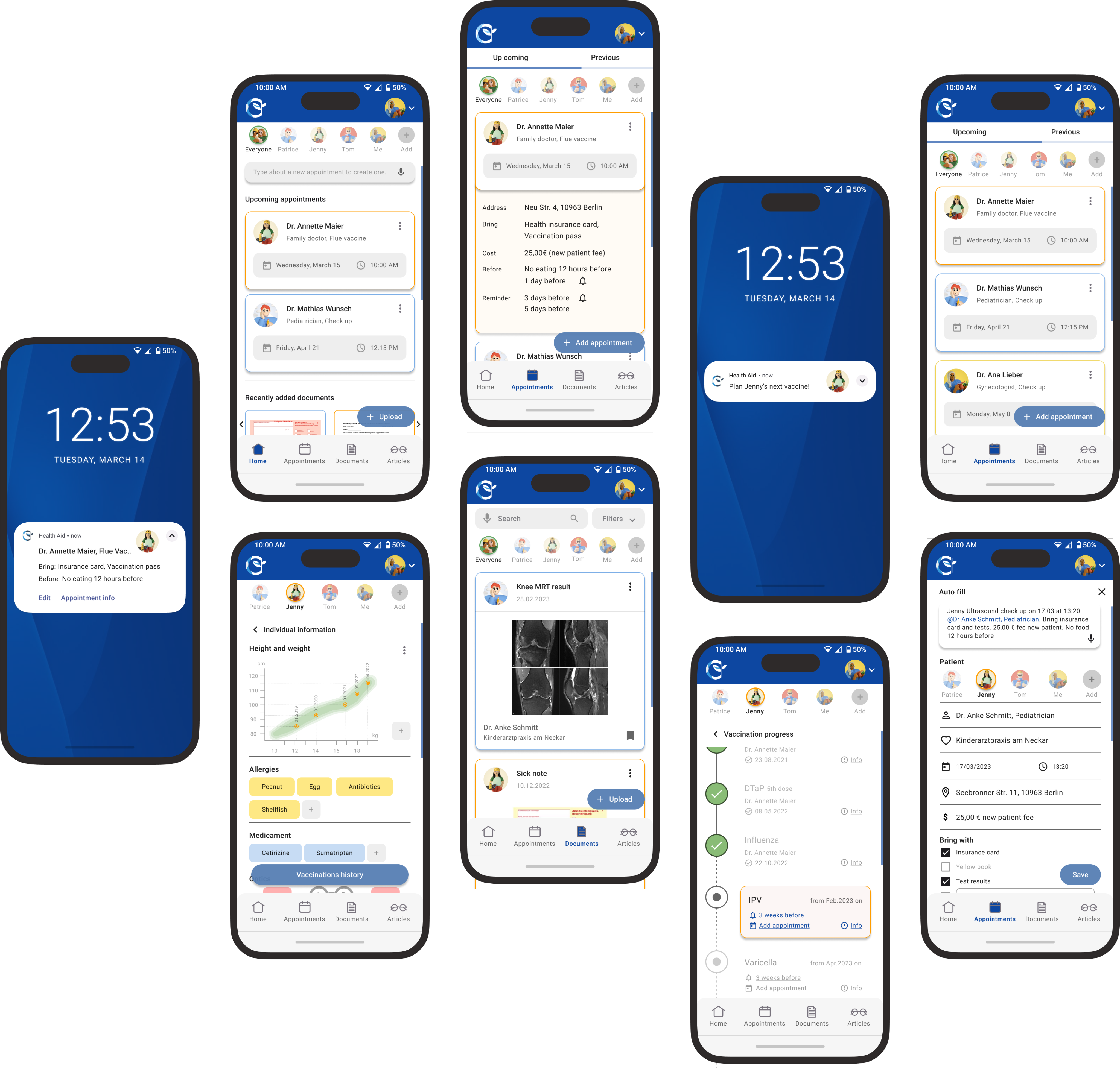
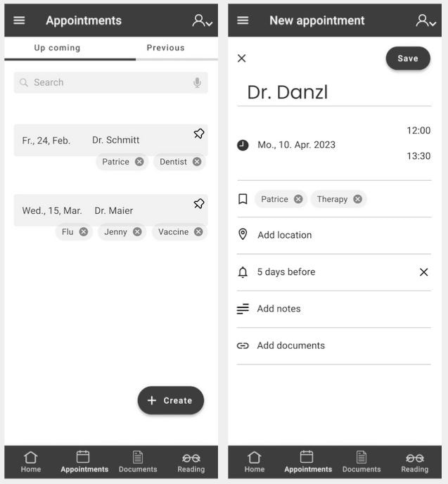
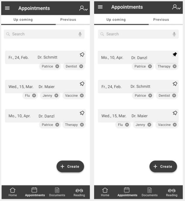
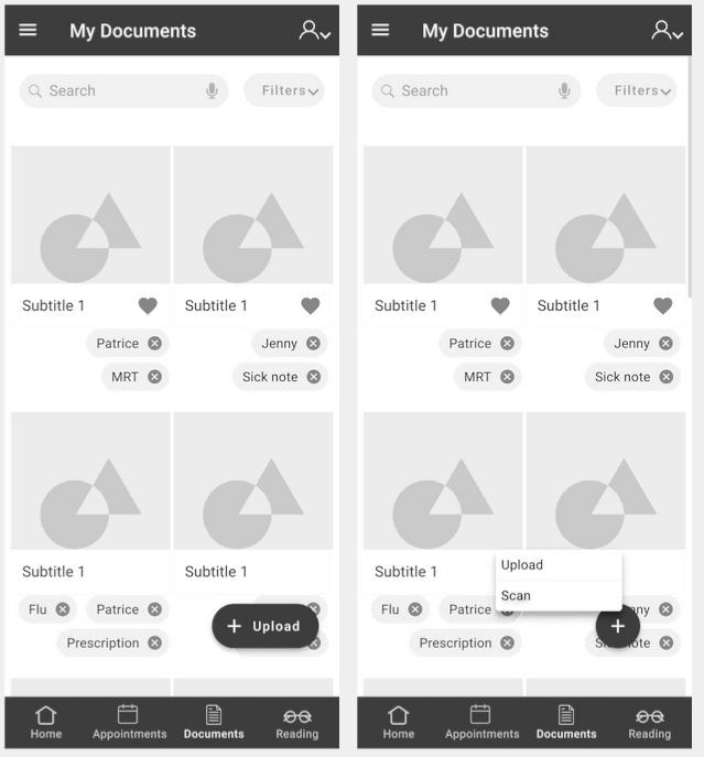
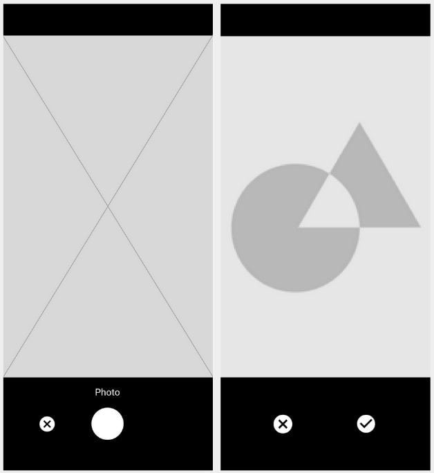
Next, I began the design process by taking a pencil and paper and sketching out low-fidelity wireframes for three key features of Health Aid: adding a new appointment, uploading a new document, and saving notes while reading an article.
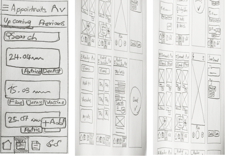
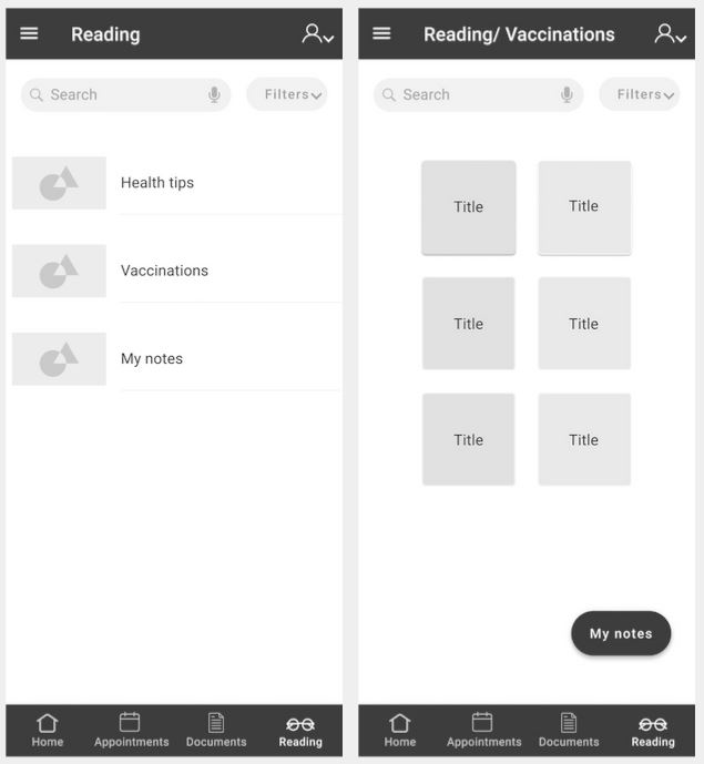
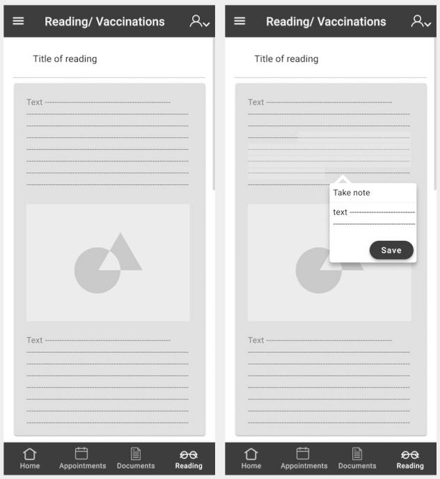
I refined the low-fidelity wireframes into mid-fidelity designs, incorporating three key Health Aid task flows: adding appointments, uploading medical documents, and reading articles with note-taking.
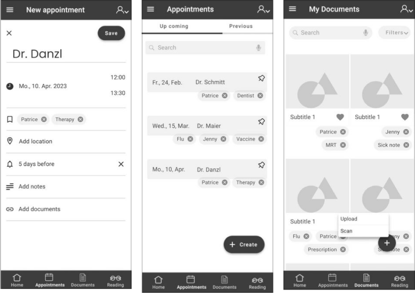
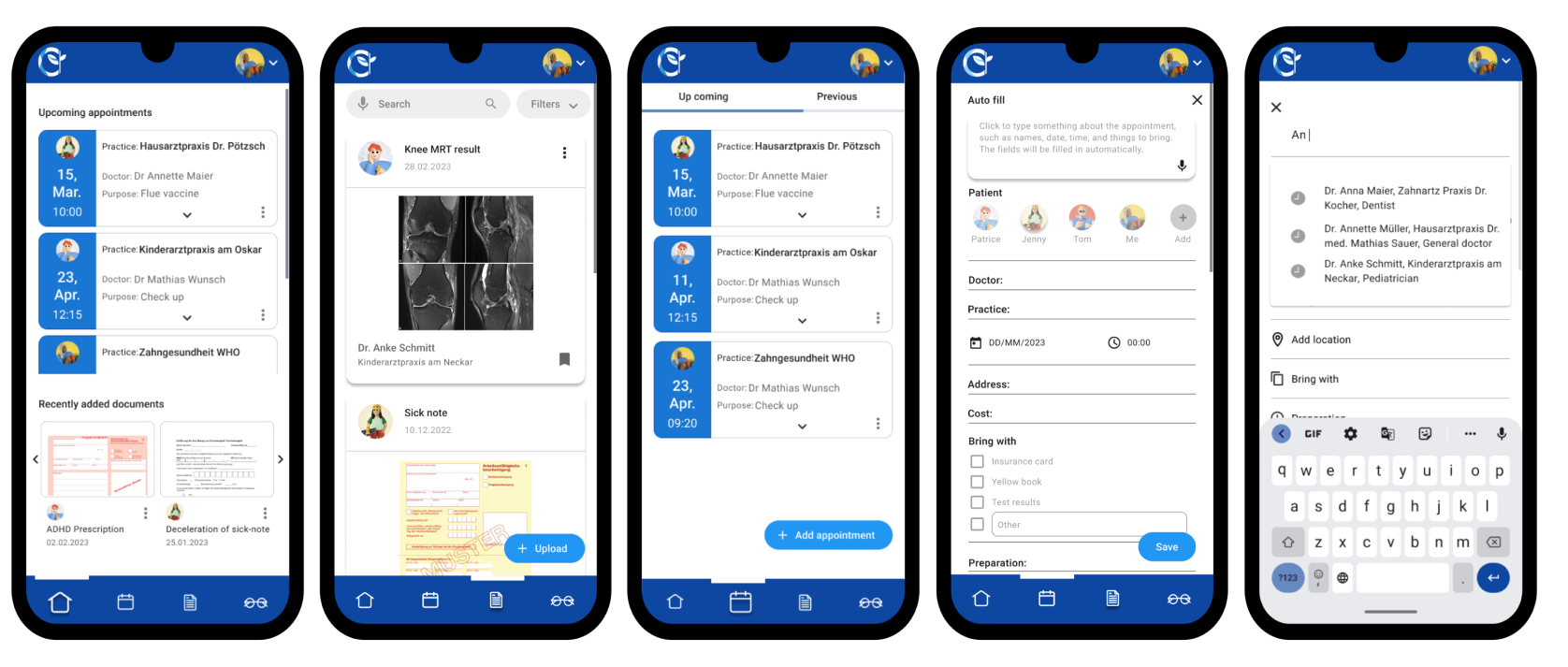
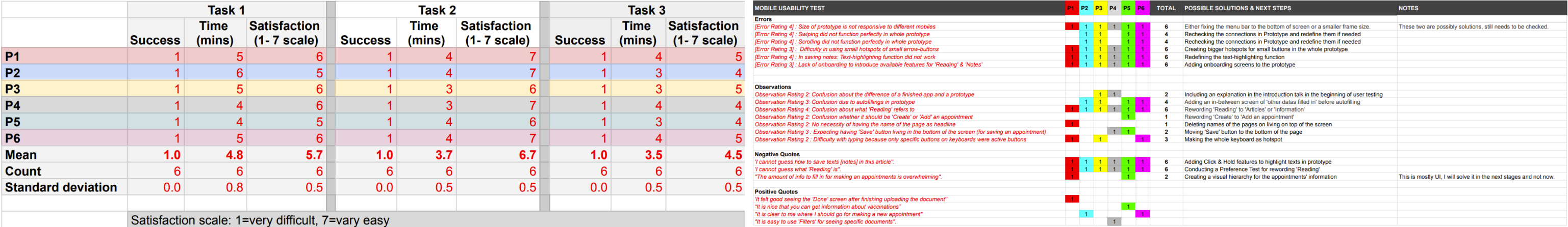
I created the first high-fidelity wireframes and built a prototype for user testing to evaluate usability, task flow efficiency, and potential issues. Based on feedback, I refined the color palette and UI elements to improve the overall experience.
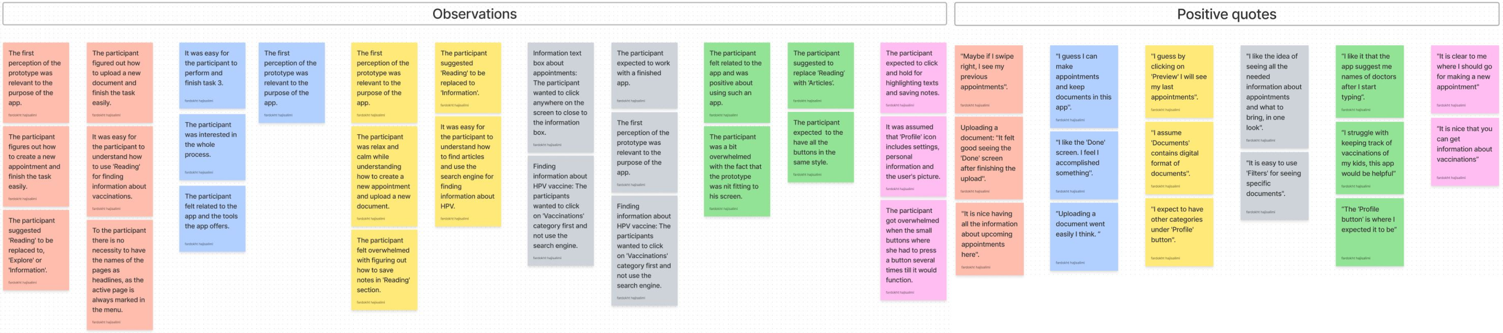
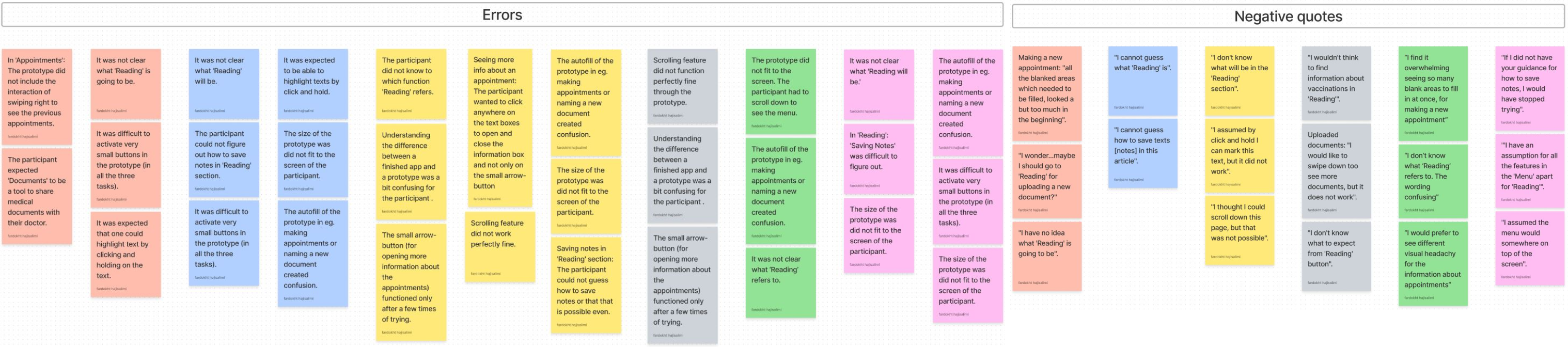
I used Lookback to record and analyze participant interactions with the prototype. All participants provided informed consent before testing.
I conducted A/B testing to compare onboarding designs with realistic vs. illustrative imagery while keeping content and typography consistent. After the first test showed poor engagement with minimalist illustrations, I redesigned them with a more vibrant style. Even then, most users preferred realistic images, saying they felt more relatable and easier to connect with—helping inform the final visual direction.
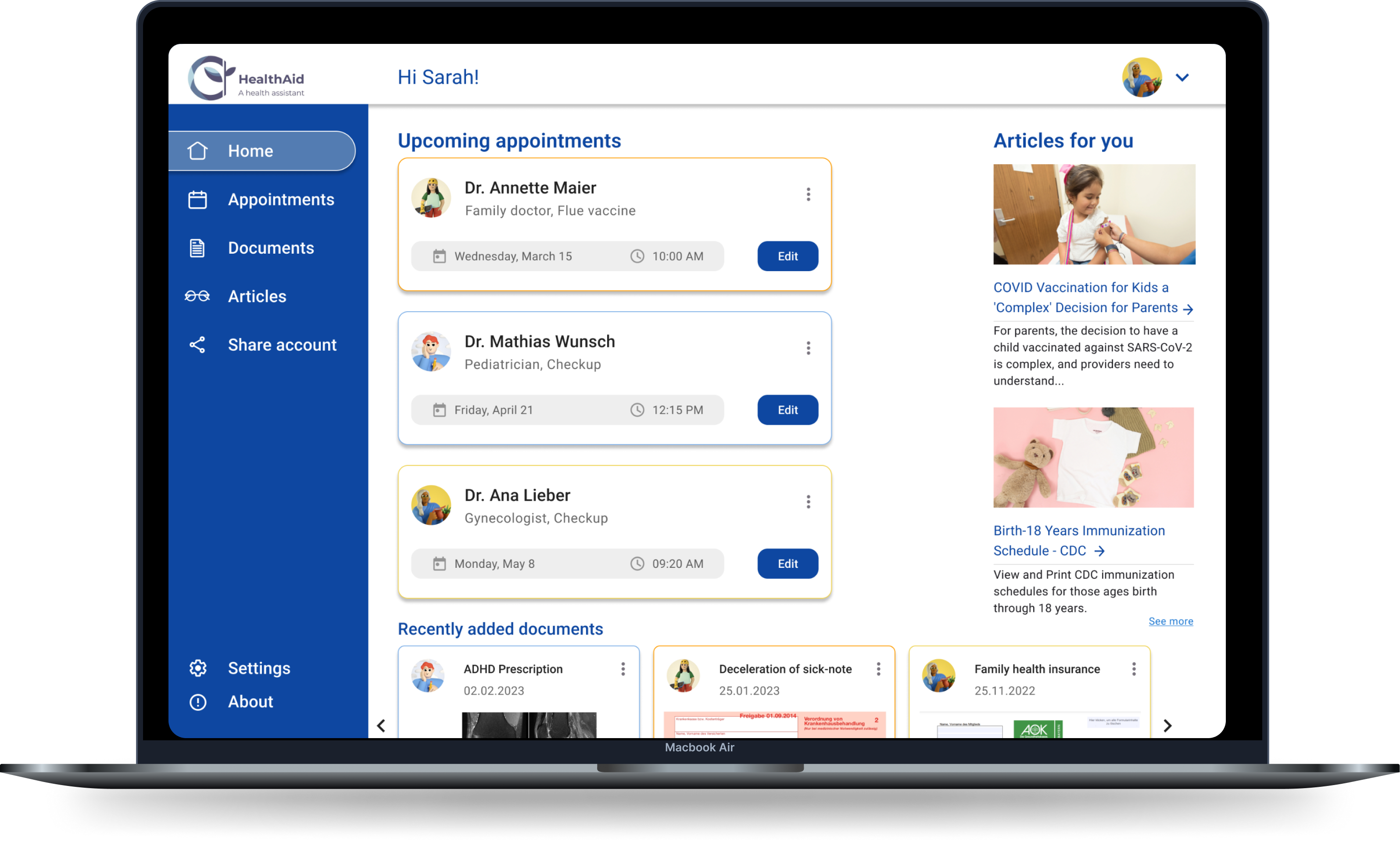
By incorporating the gained insights, I was able to refine and improve the mockups. As a result, the final mockups are now optimized for readability, accuracy, and consistency, providing an overall better user experience.
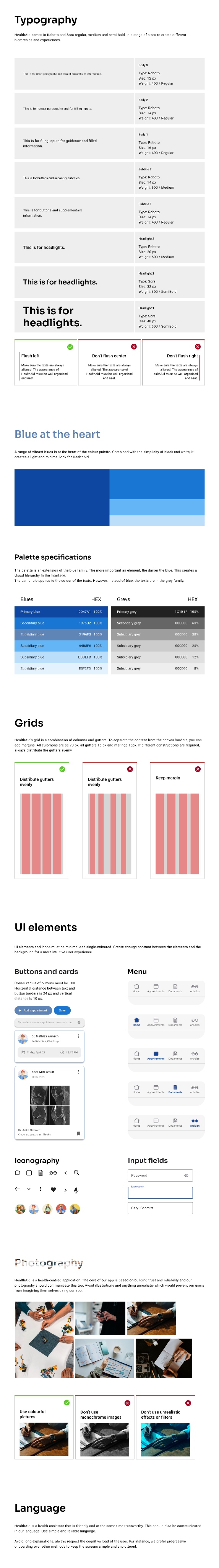
The Health Aid Design Pattern establishes consistent guidelines for the app’s interface, layout, and visual elements, ensuring a cohesive user experience and smoother collaboration between designers and developers.
A responsive SaaS app for AI-powered CV optimization, match scoring, and application tracking.
View →
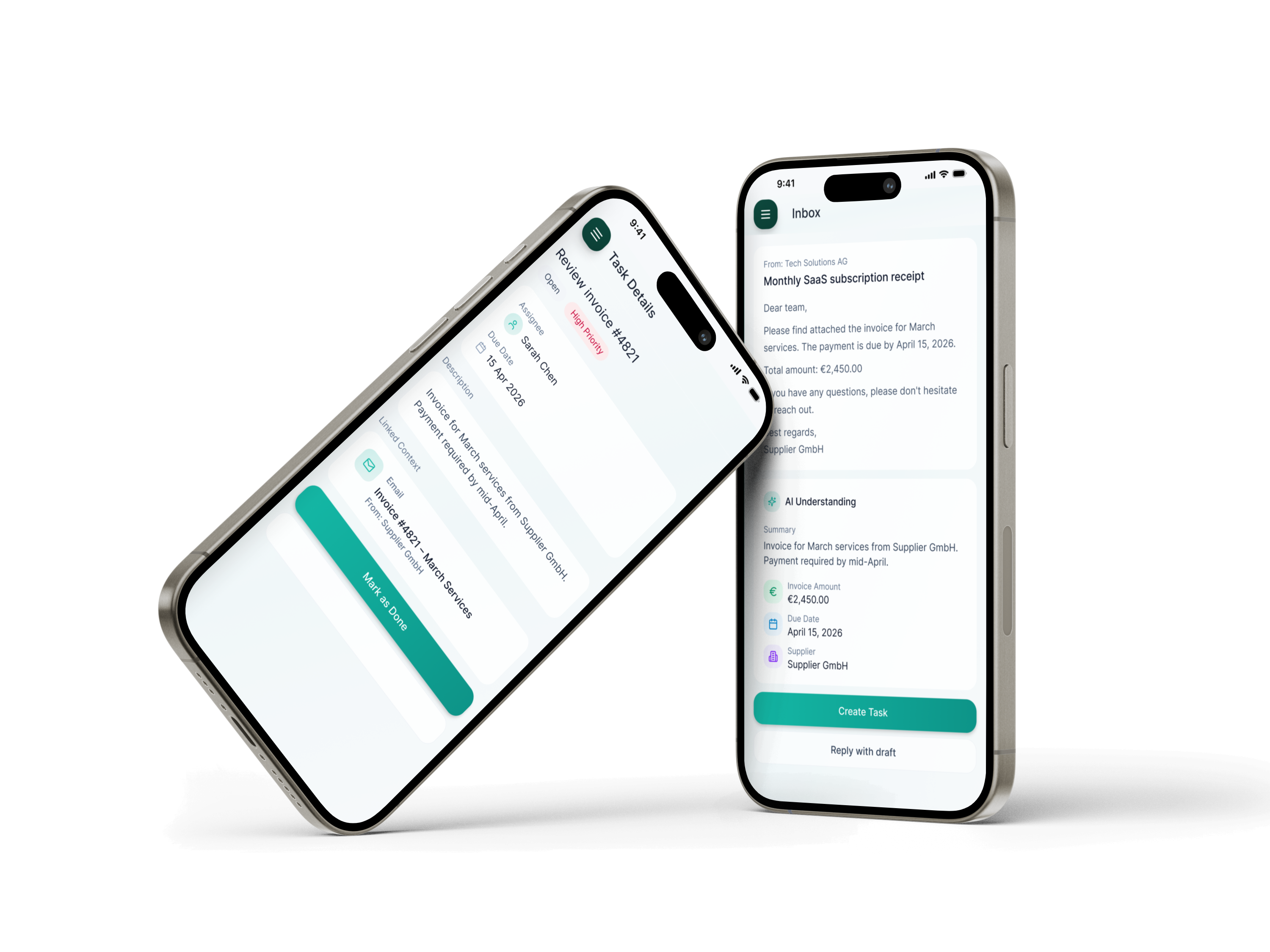
Inflow is an AI-powered workspace for SMEs that turns emails and documents into actionable next steps, reducing manual work and tool switching.
View →
FARI DESIGN
Go to Final UI
Health Aid was created as part of my certified UX design course at CareerFoundry, focused on simplifying family health management. User research revealed that parents struggle with tracking appointments, vaccinations, and medical records. Health Aid addresses this with an all-in-one, intuitive platform for managing family health, including appointment tracking, vaccination progress, medical records, and partner collaboration.
For Health Aid, I followed a user-centered design thinking approach, starting with broad research and narrowing into specific user needs. Through generative research and empathy-driven insights, I defined clear goals that guided the design process, resulting in a meaningful solution tailored to real user needs.
To understand user needs, I conducted surveys and moderated interviews in English and German with parents aged 25–45, primarily those with young children. Participants were recruited through Facebook groups and public spaces like playgrounds, pediatric clinics, and kindergartens. This diverse research approach provided valuable insights that helped shape an inclusive, user-focused solution.
By conducting a marketing profile, SWOT analysis, and UX evaluation of Doctolib and AOK apps, I was able to identify the issues users encounter while using competing products and determine their expectations for Health Aid. The aim of this analysis was to gain a better understanding of what users want in a health app and find ways for Health Aid to stand out from its rivals.
Users need a reliable and efficient way to manage the health journey of their family that saves time and reduces stress. Because managing the healthcare needs of a family can be challenging, especially when it involves keeping track of multiple medical appointments, vaccination progress, and medical documents.
We believe that by providing an intuitive and user-friendly app, families will have an easier time managing their healthcare needs. We will know this to be true when we see users’ successful adoption of the app and their improved experience in managing their family’s health journey.
Two personas were created to represent key user groups and better understand their goals, motivations, and pain points throughout the process.
To gain a better understanding of Sarah and Tom’s experience while completing specific tasks, I created Mental Models and User Journeys. These tools help me delve deeper into their thoughts, emotions, and actions throughout the process, highlighting potential pain points and areas for improvement.
To ensure a user-friendly experience for Sarah and Tom, I have developed User Flows that guide them through each step of their tasks, while minimizing potential pain points and frustrations. By placing the user’s needs at the center of the design process, my goal was to make the task flow as smooth as possible, minimizing frustration and enhancing the overall user experience.
I conducted a closed card sort using Optimal Workshop to test category labels and identify confusing wording. This revealed unclear labels like “Get Informed,” overlapping subcategories, and helped refine the information architecture using insights from the Standardization Grid, Similarity Matrix, and Dendrograms.
The insights gained from competitive analysis, user interviews, surveys, user flows, and cart sorting results, I was able to develop a more user-friendly and intuitive navigation system and an AI site map for Health Aid.
Next, I began the design process by taking a pencil and paper and sketching out low-fidelity wireframes for three key features of Health Aid: adding a new appointment, uploading a new document, and saving notes while reading an article.
I refined the low-fidelity wireframes into mid-fidelity designs, incorporating three key Health Aid task flows: adding appointments, uploading medical documents, and reading articles with note-taking.
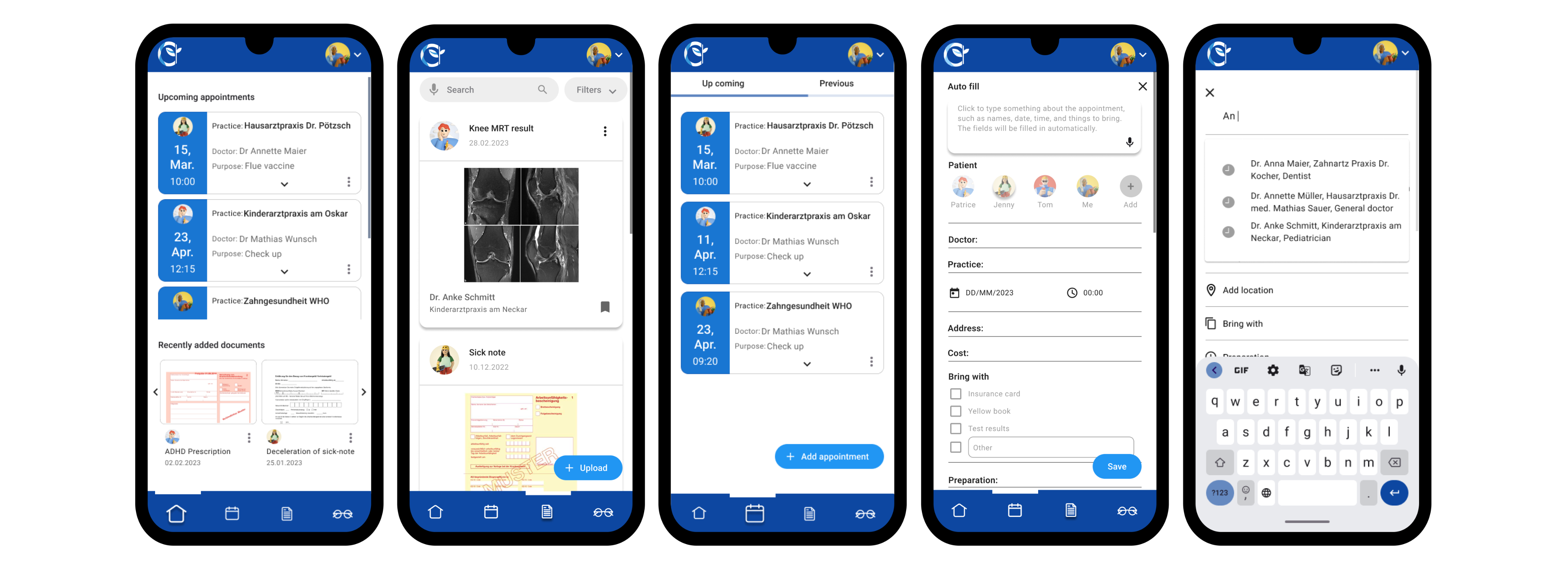
I created the first high-fidelity wireframes and built a prototype for user testing to evaluate usability, task flow efficiency, and potential issues. Based on feedback, I refined the color palette and UI elements to improve the overall experience.
I used Lookback to record and analyze participant interactions with the prototype. All participants provided informed consent before testing.
I conducted A/B testing to compare onboarding designs with realistic vs. illustrative imagery while keeping content and typography consistent. After the first test showed poor engagement with minimalist illustrations, I redesigned them with a more vibrant style. Even then, most users preferred realistic images, saying they felt more relatable and easier to connect with—helping inform the final visual direction.
By incorporating the gained insights, I was able to refine and improve the mockups. As a result, the final mockups are now optimized for readability, accuracy, and consistency, providing an overall better user experience.
The Health Aid Design Pattern establishes consistent guidelines for the app’s interface, layout, and visual elements, ensuring a cohesive user experience and smoother collaboration between designers and developers.
A responsive SaaS app for AI-powered CV optimization, match scoring, and application tracking.
View →
Inflow is an AI-powered workspace for SMEs that turns emails and documents into actionable next steps, reducing manual work and tool switching.
View →